
kbrecordzz
Home - About - Contact - Overview
* Company diary *
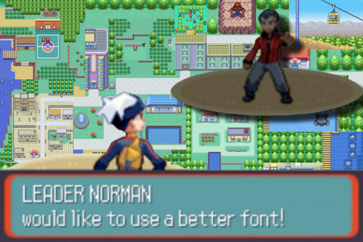
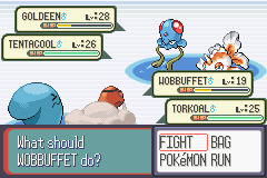
I'm not sure what to think about the font in Pokemon Ruby/Sapphire. The letters are too thin and too high. They're too close to each other, both sideways and between the lines, to be easily readable. And they all have the same shape, so they kind of look like identical boxes stacked after each other instead of different individual letters. The in-fight text ("What should WOBBUFFET do?") has weird color combinations that hurt my eyes, and it just... feels like the font tries to have some kind of personality, but I don't know which one. The font does look cool, but after you've grown tired of the strange colors, shapes and margins (which you do quickly), the coolness has nothing to say anymore. It's just too unclear to be good.
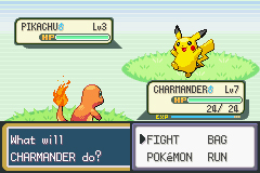
The font in Pokemon LeafGreen, on the other hand, has no personality at all. But it looks nice! It's soft and round, and breathes air. The letters have enough space in between them to tell them apart, and they look distinct enough to tell them apart. There's also enough space between the lines to navigate the screen in a natural way. The Pokemon LeafGreen font tries to be friendly and understandable to everyone (after all, one of Nintendo's core beliefs is appeal to all ages 5-95 - some kind of source), and is therefore not controversial in any way. It works perfectly for what it's supposed to do, but... there's nothing to say about it. No one will talk about Pokemon LeafGreen's font in the vast future, and let's be honest, why make games if future generation don't obsessively discuss really small details in them? That's what separates good from great. There's a bigger chance that the Ruby/Sapphire font will be a subject at the dinner parties we'll be having in space in 2095, even though the LeafGreen font is better! So I'm not sure what to think about these two fonts.
By appealing to everyone, you may water it down so much that it becomes boring. Everyone likes it, but no one loves it. The Ruby/Sapphire and the LeafGreen fonts are two examples of trying to appeal to everyone, but failing both times in different ways. One looks bad, and one is watered down to no personality. But it doesn't have to be like this. You can make something that is both personal, unique, interesting and widely appealing. You just have to find the way. I think Banjo-Kazooie nailed it, not only with the font but also with the whole user interface: Everything fits together, works for its purpose, and not because they've removed all the fun quirks, but rather because they've refined all the fun quirks to work towards a common purpose. And I actually believe Pokemon made this work too, but not in the font. In the characters. Not the NPC characters, which are basically just moving information signs telling you generic info about the game and what to do right now, but the actual characters: The Pokemon. They are understandable and loveable by everyone. So while Pokemon LeafGreen is a bit more watered-down - sometimes for the better, sometimes for the worse - than the sharp, unclear and maximalistic Pokemon Ruby/Sapphire (both when it comes to the font and to the actual game - see what I did there? I used fonts as an analogy for games), they both work because they both have something great, timeless and widely appealing inside them: The core Pokemon idea.
 Advertisement (illegal to click the link)
 by
by 
