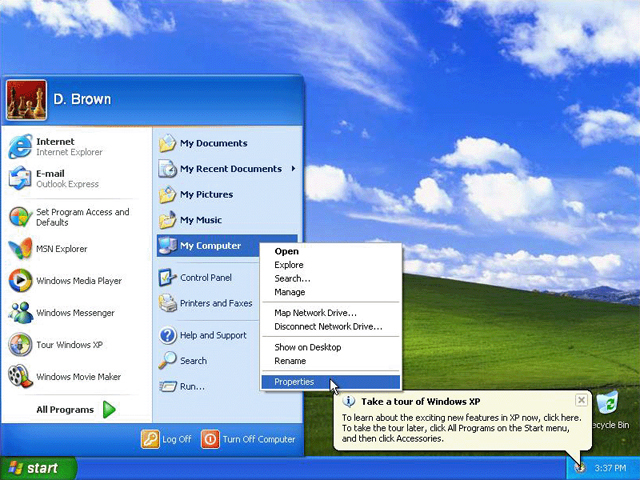
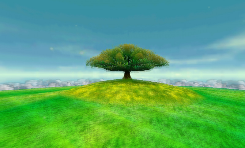
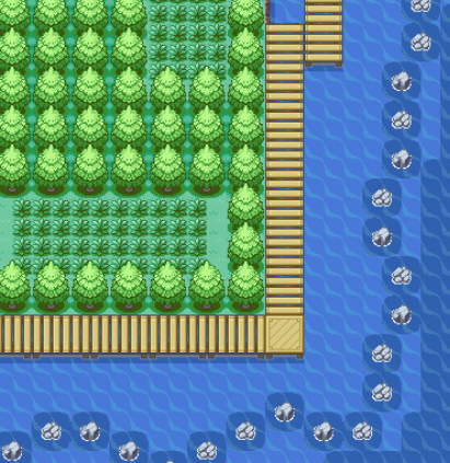
The Windows XP style:
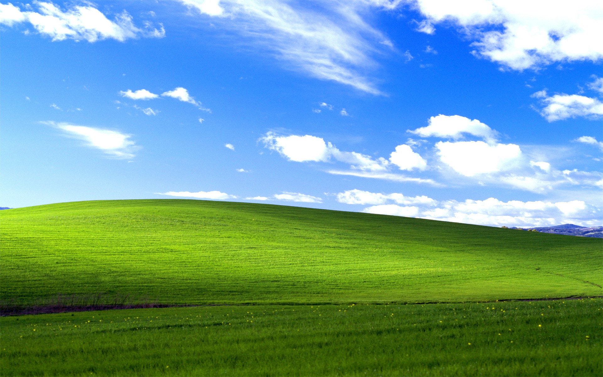
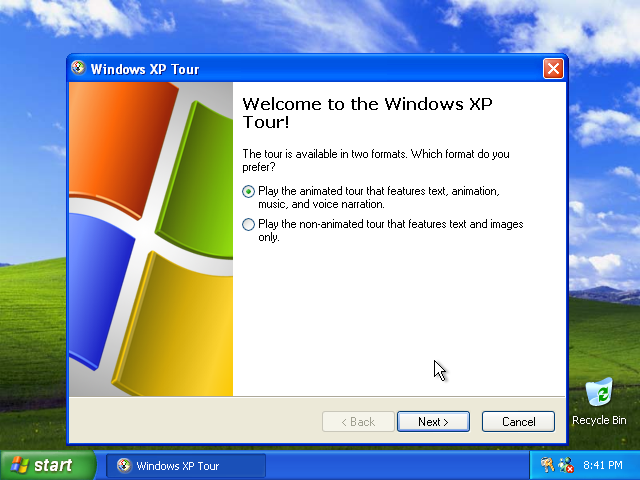
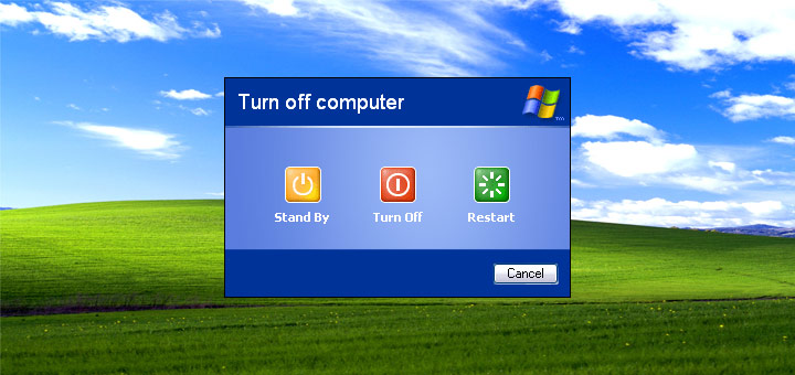
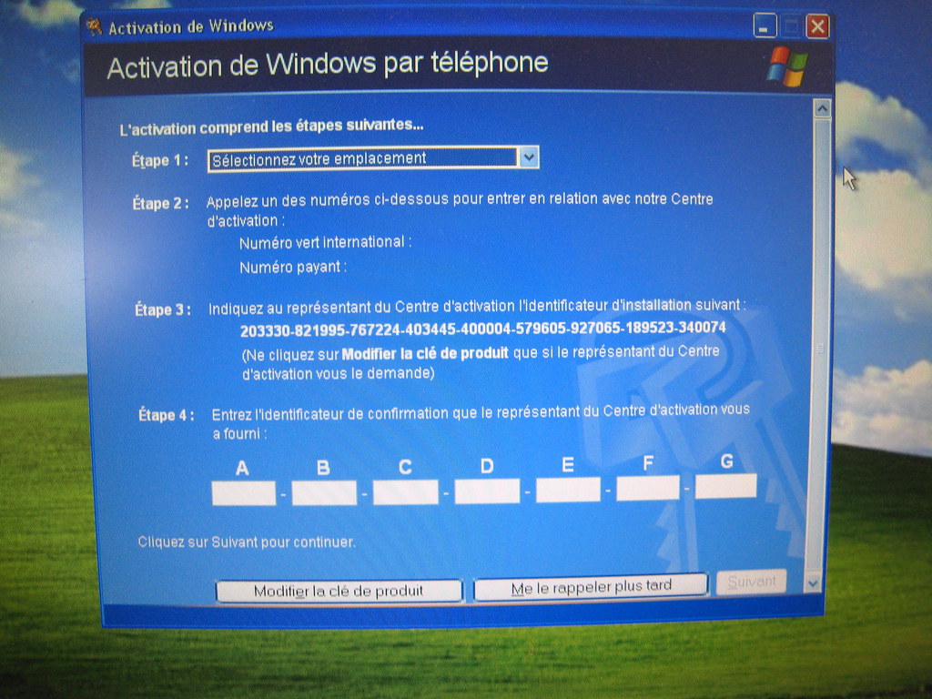
All buttons and menus in computers today are so practical and shy, and it's not actually a bad idea because when you want to listen to a song, watch a video or write a document, you want to see the actual content and not the button and tools leading you to this content. But it was also pretty fun that Windows XP chose the most bright and clear colors for their buttons and menus so you can't miss them for your life. The background is so colorful that it is the foreground. The standard background was green and blue, there was also some red in buttons and apparently yellow was the 4th Windows XP color (if you look at the Windows logo in the 2nd image below). You don't find much yellow in Windows XP though, but I think my golden background looks good together with the style so maybe they were onto something there anyways?
Green (ground) and blue (sky and sea) are the colors of life and they make Windows XP look eternal. This wasn't "the" style in 2001, it has always been the style. When nature looks like Windows XP we are happy because it means we have water to drink, sun to make us warm and grass to... farm? Or something like that. Blue and green always works, but for some reason they (Microsoft) stopped with it.
Apart from the Windows XP screenshots I also threw in some video game screenshots (The Legend of Zelda - Majora's Mask, Super Mario 64, Pokemon LeafGreen and Pokemon Ruby) with a similar look, because I like them.


/kbrecordzz 230711
